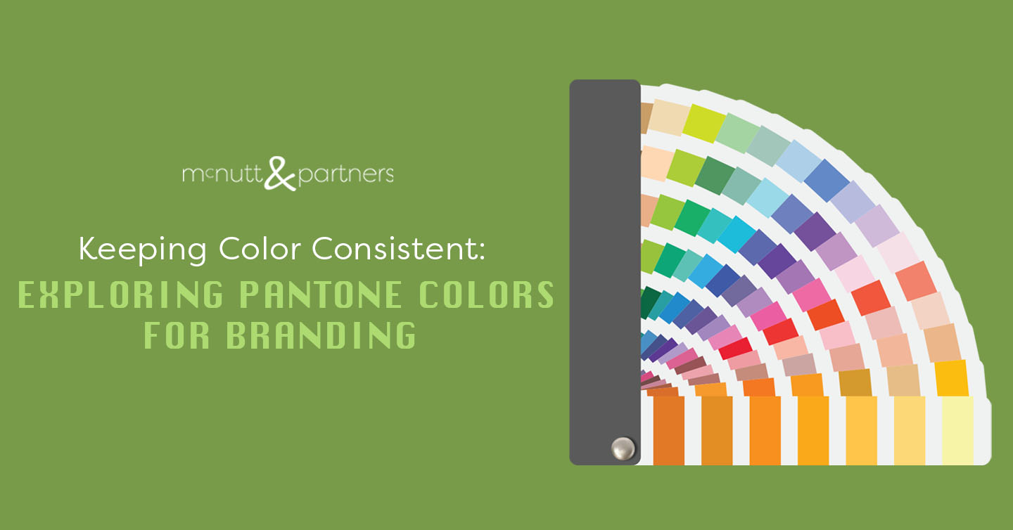
We may sound like a broken record when it comes to brand consistency—but it truly is one of the most important parts of attracting and maintaining followers. In marketing, the colors you associate your brand with should also stay consistent. If you read last week’s blog about why colors look different on screen vs in print, you might be wondering how that is possible (when dealing with multiple designers or production teams, for example). One way that marketers maintain consistency is by using Pantone colors for branding.
What are Pantone colors?
There are thousands of languages spoken worldwide. However, we only have a handful of standard systems of measurement in use (think the U.S. System vs. the metric system, for example). Why? Because having universal systems of comparison helps everyone be on the same page regardless of other external factors.
Pantone color systems serve the same purpose when it comes to colors. Think about it as a “universal language of color,” a description that comes from Pantone’s own website. Using Pantone colors for branding ensures that all parties involved are employing the exact same color with no discrepancies or variations.
Pantone describes two proprietary color systems: The Pantone Matching System (PMS) and Pantone Fashion, Home + Interiors (FHI) System. For our purposes, we’ll be talking about the PMS.
How are Pantone colors used?
The PMS color library is used for graphics, which are implemented via print, packaging, digital and screen printing (aka marketing materials). This is opposed to the FHI System which applies to textiles, paint, cosmetics and more.
Let’s consider an example. Say you’re printing a brochure, and you want it to match the colors on your business card. You can take the exact Pantone colors that were used on your business card and implement them on the brochure design so you know they will appear the same when printed.
Or, maybe you’re working with a new design team. Instead of them trying to “match” the red used in your logo on a new design, you can tell the team that the red is “Pantone 186.” Pantone 186 is the same color everywhere in this universal matching system, so you know it will be the right one.
Pantone has developed an array of physical swatch guides that you can order to find the colors you need. There’s also Pantone Connect, which gives graphic designers access to digital Pantone colors.
Why are Pantone colors so important?
Using Pantone colors for branding helps maintain and achieve brand consistency. Having a consistent look for your brand instills trust and recognition between your brand and consumers and generates an overall sense of professionalism.
Pantone colors also just make things easier for your graphic designers—and who doesn’t want that?
Summary
Pantone colors exist to help designers speak a universal language when it comes to color choice in branding. Referencing Pantone’s universal library of colors in your marketing design process is a strategy that millions of designers and producers use in their daily work—and for good reason.
McNutt & Partners is a full-service advertising and digital marketing agency. Contact us today for your marketing needs! Call 334-521-1010, or visit our contact page.

