We’d like to believe that red is red and blue is blue. But unfortunately, that’s not always the case! Color, as true as we think it to be, is subject to both the environment in which it is being displayed—and to the person viewing it. For example, colors look different on screen vs. in print—but why?
Using color in marketing
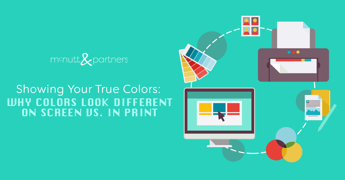
Before we answer that, it can help to visualize where exactly we use color in marketing. The answer: nearly everywhere! Print ads, branded items like T-shirts and bags, digital billboards, website graphics—the list is long.
The important thing to note here is the distinction between color as it appears to a person on a tangible, “real life” object (like a T-shirt or newspaper ad) vs. the way color appears on the screen of a computer monitor, smartphone/tablet, or digital board.
Introducing our friends: CMYK and RGB
You may have seen these combos of letters floating around here and there. But what do they mean? CMYK and RGB are integral to explaining why colors look different on screen vs. in print.
CMYK, which stands for cyan, magenta, yellow and black, refers to the composition of printer ink. RGB, which stands for red, green and blue, refers to the composition of colors on computer monitors, smartphones/tablets or any other type of digital screen.
CMYK and RGB are actual color settings you (or your ad agency) will apply to your marketing materials when designing them—depending on whether they are intended to be printed or whether they will exist in the digital world.
The science behind it
Say you go to print something that was designed for the screen using RGB. The colors will not appear as vibrant on the print-out version as they did on screen.
The way to combat this is to convert to CMYK before printing. However, even when converting RGB to CMYK first, there will always be a slight variation.
The reason has to do with light vs. ink. Computers use red, green and blue (RGB) light to display colors, while print uses cyan, magenta, yellow and black (CMYK) ink. Colors as emitted by light can never be perfectly reproduced in ink, and vice versa—but your marketing agency can get it as close as possible!
PMS can also help for printing
No, not that type of PMS. PMS stands for Pantone Matching System. The printing industry uses this system of standardized colors to help creators and printers all over the world to be on the same page about the way colors will look once they are printed. Regularly using Pantone colors can be key when it comes to maintaining brand consistency.
Screen to screen discrepancies
We’ve established that colors look different on screen vs. in print, but there’s another layer to this. Colors can even look different from one digital device to another—like a computer monitor vs mobile device, for example. This largely has to do with the screen’s resolution—for example, on a mobile device, the screen is smaller than say a laptop, so pixels are limited in the amount of space they have available to occupy.
Keep this in mind if you are sharing an image with another party. If said party says they are seeing a darker blue than you are seeing, for example, the difference in digital device could be the reason.
Summary
When using color in marketing for mediums like print ads, branded items, digital displays and more—we can’t control the fact that color may be interpreted differently from human eye to human eye. However, we can be aware of the way that color varies depending upon where we’re “uploading” it on the front end. Understanding that colors look different on screen vs. in print—and the fact that using RGB and CMYK formats correctly can help this—is key to keeping the quality of your marketing materials top-notch!
McNutt & Partners is a full-service advertising and digital marketing agency. Contact us today for your marketing needs! Call 334-521-1010, or visit our contact page.