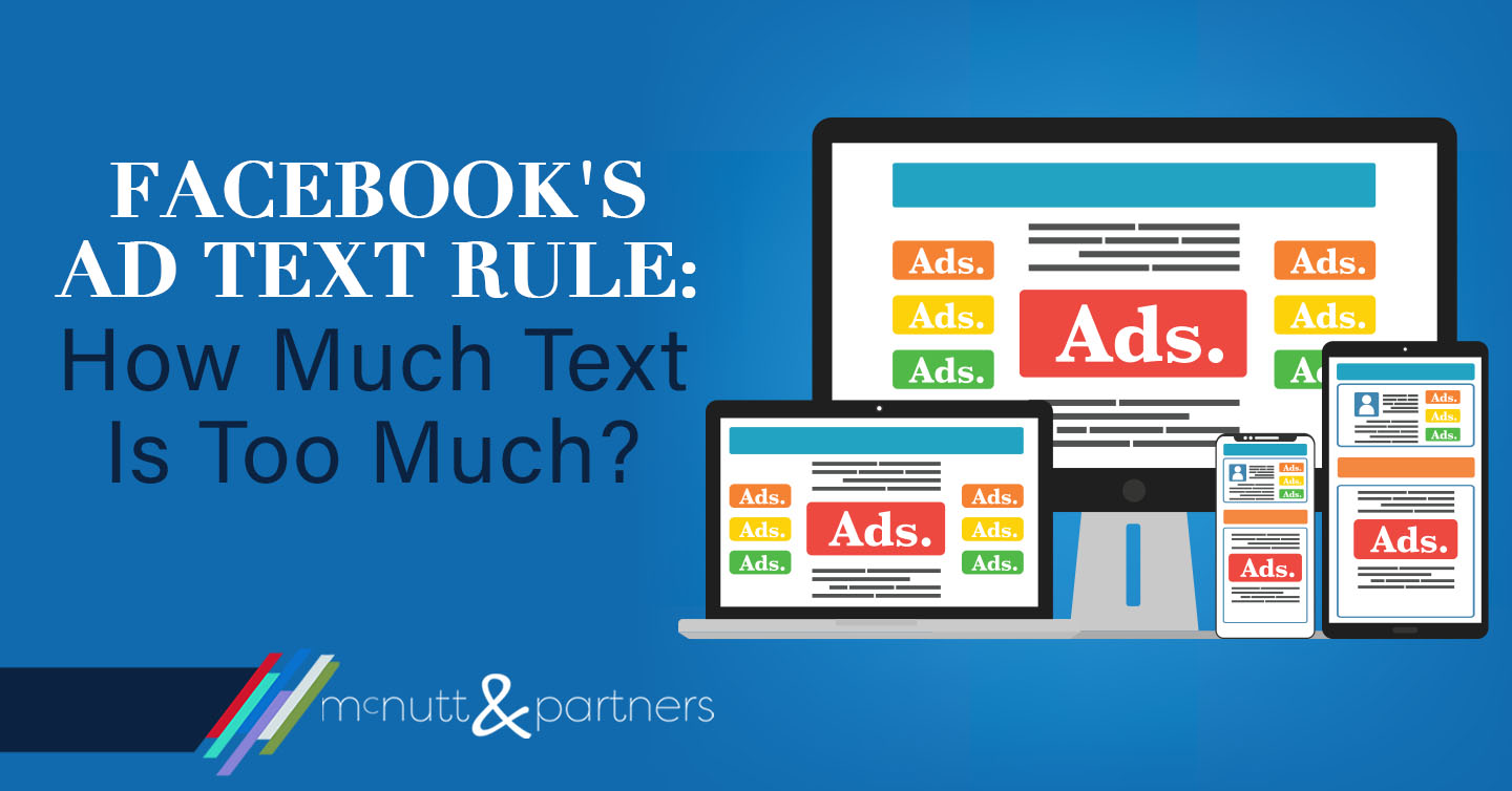
Ever made a paid Facebook post? Ever had your ad rejected due to “too much text?” Facebook’s ad text rule has evolved over the years. The way that advertisers once measured whether their ads had too much text for Facebook’s liking is not the same as it used to be.
Why paid Facebook ads?
Paid Facebook ads are nearly a necessity these days for getting eyes on content that is posted to a business page. In 2018, Facebook announced that its algorithm that determines what content appears in a user’s news feed would be prioritizing that of “friends and family” over businesses. That means unless you have an extreme amount of consistent follower engagement, it wouldn’t be surprising if your organic content got lost in the shuffle. For this reason, we recommend a monthly budget for paid Facebook ads for our clients.
What is Facebook’s Ad Text Rule?
Facebook restricts the amount of text displayed on any graphics posted as ads on its platform. This not only includes calls to action or descriptions overlaid on graphics, but also text-based logos and watermarks. The reason for the restriction? According to the social media giant, research shows its users prefer ads with little to no text.
Marketers were previously told to follow the “20 percent text rule” when it came to ad graphics. The rule stated that advertisers could only cover 20 percent or less of their graphic with text. As a result, Facebook and others developed grid tools that you could use to see whether or not your ad followed the rule. For example:
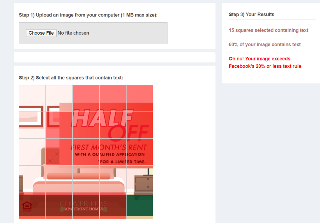
This graphic, with 60 percent of the image covered with text, violated Facebook’s 20 percent rule. Therefore, it would not be allowed to run at all since it was in violation of Facebook’s ad guidelines.
Facebook introduces a “new solution”
Facebook’s ad text rule no longer relies on the 20 percent grid tool, however. In 2016, Facebook Product Marketing Manager Afsheen Ali was quoted as saying, “We’re shifting to a new solution to improve this experience which allows advertisers more flexibility while still allowing us to maintain an enjoyable experience for people.”
So does that mean that ads can now have more than 20 percent text on an image? Not necessarily. Rather than the black and white rejection of ads with 20 percent or more text, Facebook’s current tool shows ads being placed into one of four categories depending on the amount of text they have. The categories are:
- OK (Your ad will run normally.)
- Low (Your ad’s reach may be slightly lower.)
- Medium (Your ad’s reach may be much lower.)
- High (Your ad may not run.)
In other words, instead of all out rejecting ads with 20 percent or more text, Facebook now limits ad reach depending on how much text the ad displays.
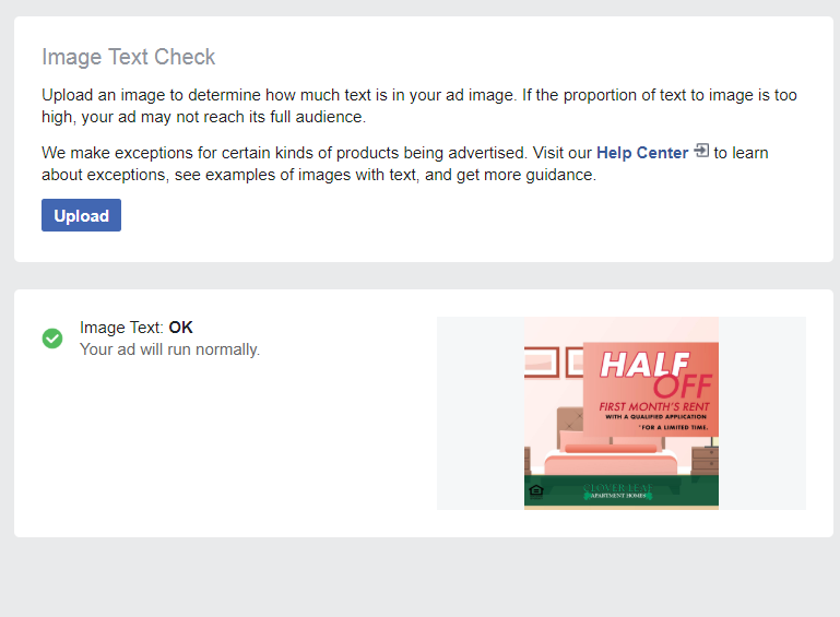
Here’s the same sample graphic we showed above, but plugged in to Facebook’s current ad text indicator.
Conflicting information
In this instance, Facebook tells us that the amount of text on our ad is in the “OK” category, which supposedly means that our ad will run normally. Keep in mind, this is the same exact graphic that the grid tool told us displayed more than 60 percent of text, which would NOT have been allowed to run at all.
What we have here is some conflicting information regarding Facebook’s ad text rule. The current system tells us it’s OK text-wise. However, we have posted ads that Facebook has told us were “OK” using this system that then failed to run properly.
Best practices
Confusing? Definitely. But the way to ensure that your ad has the most effective reach is to follow a few best practices.
- Display less text on your graphics. You might be thinking, “duh,” that’s what we just talked about. But really this means since there doesn’t seem to be any definitively stated acceptable proportion, just use your best judgment. Despite that the 20 percent rule may no longer be “the official” ruling, it’s safe to stay that you should not have any more than that amount on your ads.
- Include more details in your caption copy. With less room for text details on the actual ad graphic, you should rely on your caption space. Include any additional information, disclaimers, contact info, etc. in the caption copy rather than on the ad itself.
- Limit logo size. Keep in mind that logos and watermarks with text are counted in your text proportion. Try making your logo space smaller to give your ad a better chance of performing successfully.
- Decrease the contrast between colors. There seems to be some connection Facebook scoring ads to run better when there is less of a contrast between two colors on a graphic. For example, we have had ads that displayed white on black that were not placed in the “OK” category, but when changed to a dark blue/light blue they were approved.
Summary
Facebook’s ad text rule can be a bit murky, but following a few best practices seems to do the trick for getting your ads delivered. If Facebook’s research that people respond better to ads with less text is in fact accurate, it could help you to tone down the copy on your ads anyway.
Does all of this make your head spin? Don’t worry, that’s why we’re here!
McNutt & Partners is a full-service advertising and digital marketing agency. Contact us today for your marketing needs! Call 334-521-1010, or visit our contact page.