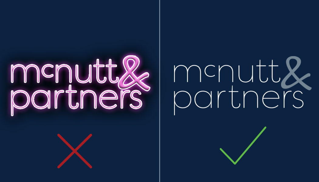
As a visual representation of your brand, logos are a wonderful thing. They can say a lot about what you do and stand for without even using words! They’re also versatile, with the ability to be used across your digital assets, print materials, promotional items and so much more. With all that our logos do for us, we are here to say: treat them kindly. We are sharing what not to do with your logo to help you do just that.
When it comes to your logo, avoid:

Skewing it or stretching it.
Stretching your logo disproportionately can lead to some elements of the logo looking skewed in comparison to others.

Scaling it incorrectly.
There’s a right way and a wrong way to go about resizing your logo. If you do it the wrong way, you can end up altering the scale, which will make it pixelated.
Vector files, for example, retain their quality when the size of the art is altered. Attempting to alter a logo that is a raster file, on the other hand, will lead to the issue described above.
Using the wrong file format.
That leads us to our next point regarding what not to do with your logo. Using the wrong file format in the wrong instance can lead to your logo not looking its best. Our guide to logo file types can help you decide which type of file to use for which applications.
Doing away with file formats you cannot open.
Speaking of file formats, you should have your logo saved in each of the various file formats from our guide. And just because you can’t open one of the file types on your computer does not mean you should delete it. Chances are, your graphic designer will be able to open them and will need them in the future.

Altering it in such a way that it affects brand consistency.
As a full-service ad agency, we are big on brand consistency for all our clients. Staying on brand keeps you looking professional as well as avoids confusion for your brand followers. That being said, be careful not to alter your logo in such a way that it affects brand consistency. This includes adding shadows, glows, colors or effects that can completely change the look of your logo.

Placing it on a busy background.
Your logo makes sense in a lot of places, but in front of a busy background is not one of them. When you place your logo on a heavily-patterned background, for example, the background ends up competing with the logo itself. This can lead to your logo getting lost and not being as prominent as it deserves to be.
Do: have your graphic design team create a style guide.
Now that we’ve shared what not to do with your logo, here’s one thing you should do: have your graphic design team create a style guide that includes instructions on how to properly use your logo. For example, it can contain information on what backgrounds to place it on, alternate logo versions (stacked, horizontal, etc.), colors, font choices and more. Check out our checklist of items to include in a brand style guide for more information.
In a “nutt” shell
Your logo is a critical component in your marketing toolkit. Maintain these best practices for your logo in order to make sure it’s always looking its best and in turn, that your brand is always looking its best.
McNutt & Partners is a full-service advertising and digital marketing agency. Contact us today for your marketing needs! Call 334-521-1010, or visit our contact page.

