With Valentine’s Day on the horizon, reminders of the holiday are popping up in stores, on television, online and virtually anywhere consumers’ eyes will land. Visual representations of love come in various forms—from hearts and lipstick kisses to Cupid’s arrows and red roses. But sometimes, the best way to visually represent a concept is to use the word itself. That’s what artist Robert Indiana did in 1964 when he created the design that would be the precursor to the iconic “LOVE Sculpture.”
The design
Born Robert Clark, artist Robert Indiana’s fascination with American signage coupled with the power of ordinary words led him to create the piece featuring the letters LO over the letters VE, with the O angled sideways. The oblong negative space in the center of the O creates a line leading the viewer’s eye to the V. It is said that the visual movement suggested by the O serves to evoke passion, exhilaration, and other thrilling emotions associated with love itself.
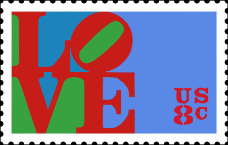
Indiana’s original image featured red letters overlaid on green and blue backing, which is the same design that eventually appeared on a U.S. postage stamp. The colors signify personal concepts for Indiana, with the red and green nodding to the Phillips 66 gas station sign where his father (deceased at the time Indiana created LOVE) worked during the artist’s childhood. The blue signifies the skies of his home state, Indiana.
The design originated as a pop art image that served as a print for the Museum of Modern Art Christmas ad in 1964. The next year, the museum commissioned him to design a similar Christmas card to be sold in its gift shop, and the card soon became one of the store’s most popular items.
The sculpture
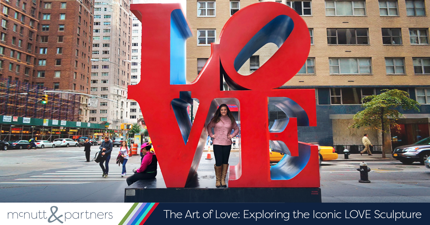
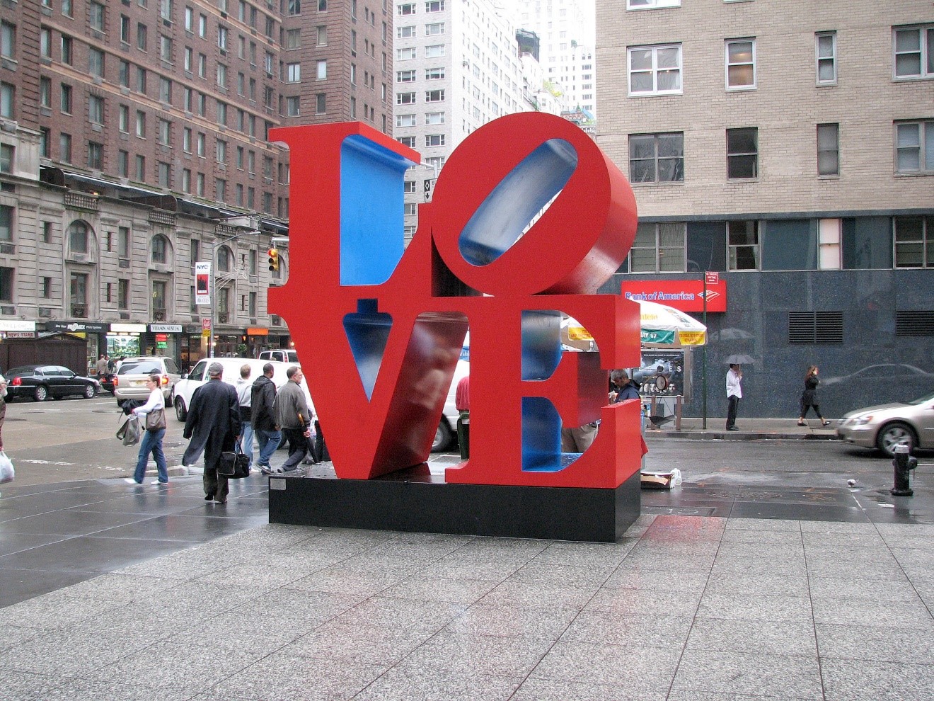
The two-dimensional print proved popular and enough to translate into three-dimensional form. The success of the MoMA’s Christmas card led to an entire LOVE show that included paintings, drawings and small sculptures showcasing the design. In 1970, Indiana built the first of many large-scale LOVE sculptures for display in the public eye, measuring 12 feet by 12 feet. The LOVE Sculpture at the Indianapolis Museum of Art is the original sculpture rendition, and others were constructed in major cities including New York, Philadelphia, New Orleans and even internationally in cities like Vancouver, Tokyo and Singapore.
The implications
Indiana’s pop art print-turned worldwide sculpture came to represent an entire state of mind during the 1960s and ‘70s. It was adapted by the hippie “free love” movement in the ‘60s, for example, and then later in the 1990s by skateboarding culture after the sport was banned in Philadelphia’s LOVE Park.
The design experienced widespread reproduction, adaptation and even parody across a variety of mediums, including album and book covers, television, public murals and more. Indiana failed to copyright the original LOVE design, so cheap commercial reproductions occurred in the form of paperweights, keychains, T-shirts and other trinkets that Indiana would never yield profit from.
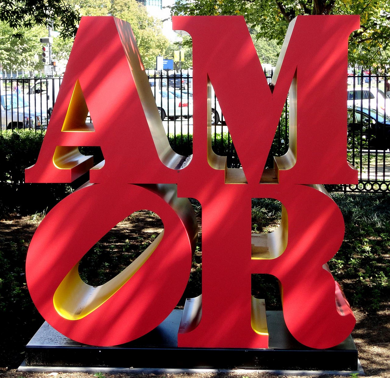
Versions of the LOVE Sculpture now exist in Hebrew, Chinese, Italian and Spanish in addition to the original English.
Despite its widespread popularity, Indiana came to consider the LOVE design the bane of his existence. In an interview with NPR, Indiana says, “LOVE bit me. It was a marvelous idea, but it was also a terrible mistake. It became too popular; it became too popular.” He went on to say that he is among those who would rather not exist in the public eye, which is why he left the New York art scene to live on an island off the coast of Maine in 1978.
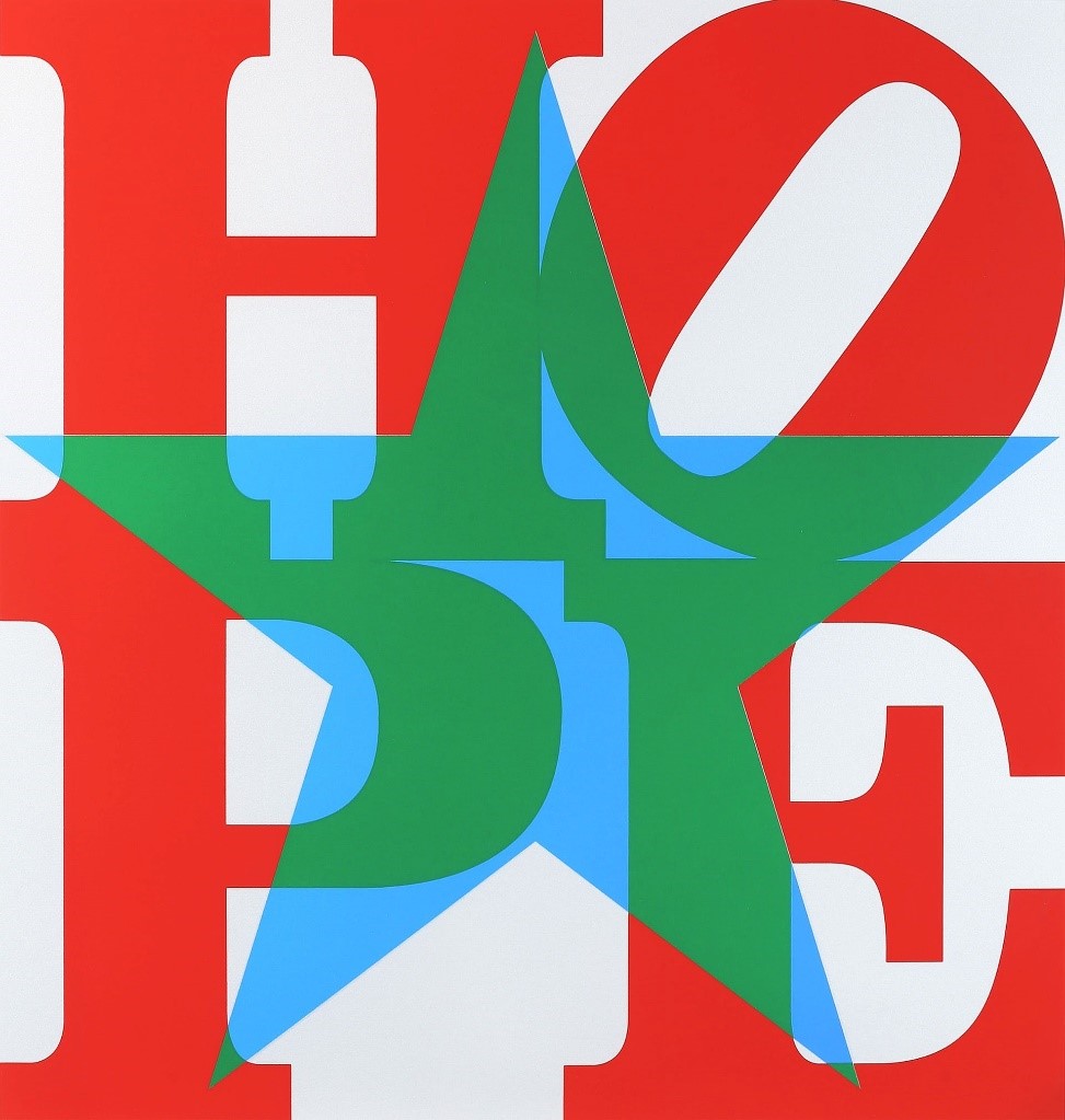
In 2008, Indiana’s distaste for the design was tempered, however. Inspired by then presidential candidate and Indiana Senator Barack Obama, the artist Indiana created campaign materials using the word “HOPE” in the iconic LOVE fashion.
The takeaway
The LOVE sculpture, its predecessors and its followers exemplify the power of typography when used thoughtfully. “Love” itself is already a word powerful enough to stand on its own and evoke emotion, but Indiana’s treatment of the word takes that evocation to a higher level.
Through the use of graphics in marketing, we have the ability to take advantage of the fact that human emotion is directly affected by what we consume visually. Indiana may have been the first to do it so effectively, but the concept leaves the door open for endless potential.
For graphics and all of your digital or traditional marketing needs, contact McNutt & Partners today! Call us at 334-521-1010 or visit our contact page.